Improving Conversion on a Partner's Editorial Pages — Without Owning the Product
Role:
Lead Designer
Timeline:
~2 months
Collaborators:
UX Researcher (led research), TechRadar editorial & dev team
My responsibilities:
Heuristic evaluation facilitation, design direction, wireframing, preference testing, stakeholder presentation, design communication to partner
Partner:
TechRadar (ExpressVPN's highest-converting editorial partner)
Context
ExpressVPN partners with tech publishers who write VPN reviews and comparisons. Readers who purchase through affiliate links on these articles drive significant revenue. TechRadar was ExpressVPN's highest-converting editorial partner — which made it the highest-stakes relationship to get right.
The challenge: we didn't own any of these pages. TechRadar controlled the editorial content, the design, and the development. Our ability to improve conversion depended entirely on our ability to research, design, and persuade — then hand over recommendations that a separate organization would choose whether or not to implement.
This is a fundamentally different design problem from working on your own product. You can't just ship changes. You have to build a case strong enough that someone else wants to ship them for you.
The Problem
TechRadar's VPN review pages were driving traffic but underperforming on conversion. We believed the page experience — not the content quality — was the bottleneck.
To validate that assumption, we ran two parallel research tracks:
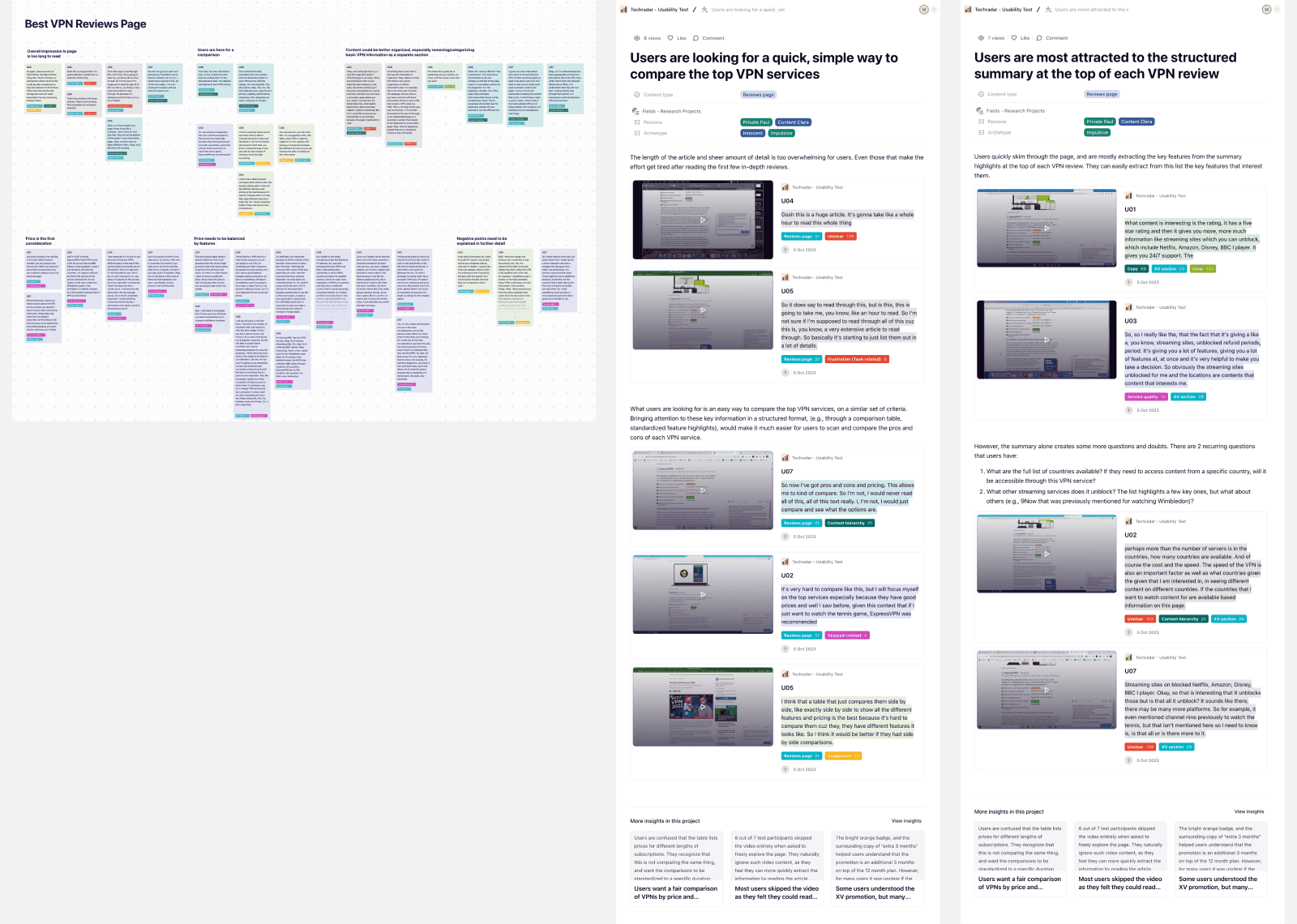
User interviews (led by our UX researcher). 6 VPN-aware non-customers were recruited for moderated sessions using a think-aloud protocol. I used the findings to identify behavioral patterns in how users navigated editorial review content.
Heuristic evaluation (led by me). I facilitated a heuristic evaluation session with our internal design team, systematically reviewing TechRadar's VPN pages against usability principles.
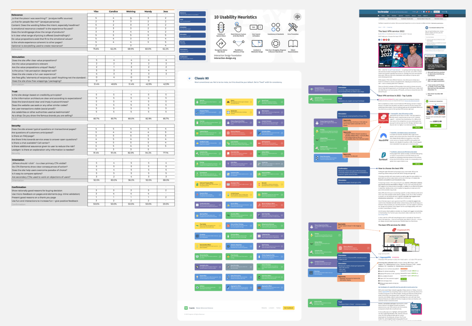
What We Found
The research converged on three core problems:
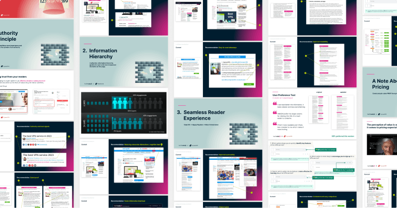
KEY INSIGHT 1
Users scan, but the page doesn't support scanning.
Review articles were long and text-heavy. Users wanted quick comparisons but had to dig through dense paragraphs to find them. The structured comparison table at the top of the page drew the most attention and trust — but the rest of the page didn't match that standard.
KEY INSIGHT 2
Information hierarchy worked against decision-making.
Key differentiators between VPN services were buried mid-article. Headings and section structure didn't help users quickly answer "which one should I pick and why?"
KEY INSIGHT 3
Recommendations lacked visible reasoning.
Users saw that TechRadar ranked certain VPNs higher, but didn't understand the criteria. This hurts credibility — if the recommendation feels arbitrary, users don't trust it enough to click through.
The Constraint: Editorial Resistance
TechRadar was initially hesitant to make significant design changes. As a trusted editorial brand, they were concerned that redesigning review pages could make the content feel biased or overly commercial — which would undermine the editorial credibility that made the partnership valuable in the first place.
This was a legitimate concern, not just organizational inertia. The entire value of an editorial recommendation depends on it feeling independent. If the page looks like it was designed by the company being reviewed, readers lose trust. So every design recommendation I made had to pass a test: does this make the page better for readers, or does it just make it better for ExpressVPN?
I navigated this by:
Framing every change as reader-first. Instead of presenting recommendations as "this will increase affiliate clicks," I framed them as "users told us they can't find the information they need — here's how to fix that." The conversion improvement was positioned as a byproduct of better UX, not the primary goal.
Using research to de-risk. TechRadar didn't have an in-house designer or UX researcher. By presenting real user feedback and preference test results, I gave them evidence that these changes were what their readers wanted — not just what ExpressVPN wanted.
Keeping changes lightweight and scalable. Rather than proposing a full redesign (which would have been rejected), I focused on modular improvements that could be applied across all VPN review pages, not just the ExpressVPN one. This made the changes feel like a platform improvement rather than a partner-specific ask.
Preference Testing
Before presenting to TechRadar, I ran user preference tests to validate key design decisions. These weren't A/B tests on live traffic — they were unmoderated tests comparing design variations for specific elements like the VPN summary layout and content hierarchy.
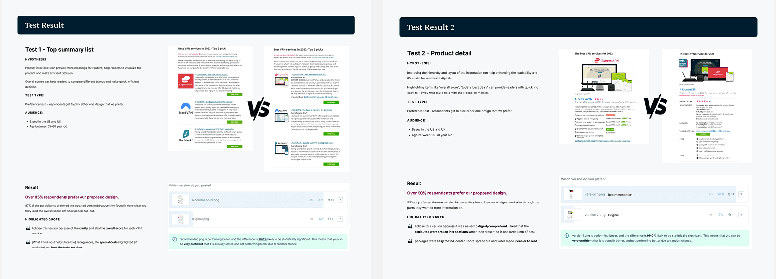
This step was strategically important: presenting recommendations backed by user preference data made it significantly easier for TechRadar to say yes. They could adopt changes knowing users had already validated the direction, which reduced their perceived risk.
Design Solution
This step was strategically important: presenting recommendations backed by user preference data made it significantly easier for TechRadar to say yes. They could adopt changes knowing users had already validated the direction, which reduced their perceived risk.
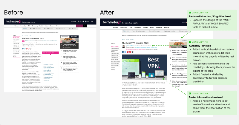
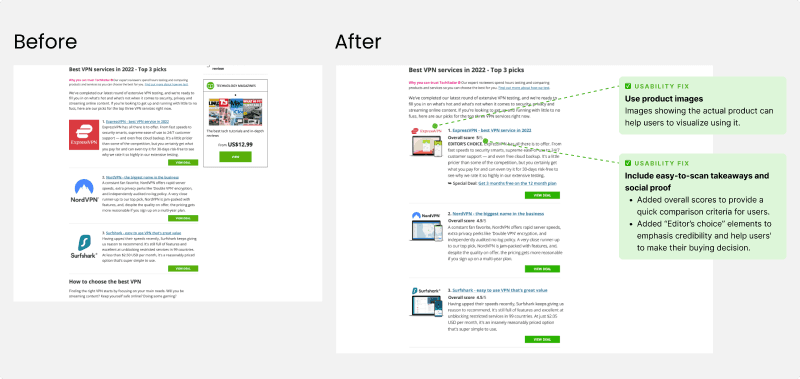
SOLUTION 1
Improved comparison blocks at the top of the page.
Since research showed the comparison table drew the most trust and attention, I redesigned it to be more scannable with clearer visual differentiation between services.
SOLUTION 2
Pros/cons summaries for each VPN.
Instead of forcing users to read full paragraphs to understand tradeoffs, each VPN section got a concise summary. This directly addressed the "users scan but the page doesn't support scanning" problem.
SOLUTION 3
Stronger visual hierarchy throughout.
Section headings, typography weight, and spacing were restructured so users could jump to the comparison that mattered to them without reading linearly.
SOLUTION 4
Strategic CTA placement.
Affiliate buttons were repositioned to appear at natural decision points — after a user has enough information to act — rather than scattered throughout the page. This balanced conversion goals with editorial integrity.
Design Communication
Since TechRadar didn't have an in-house designer, I couldn't hand off a Figma file and expect it to be implemented. I created a comprehensive design presentation that served as both a pitch and a spec:
The presentation included the research findings, design rationale for each recommendation, preference test results, and implementation guidance. It was designed to be understood by both editorial stakeholders (who cared about content integrity) and developers (who needed specs).
This document became the single artifact that got the project approved and built.
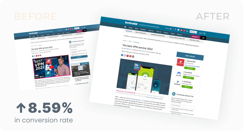
Results
+8.59% increase in conversion within one month on TechRadar's VPN review pages.
TechRadar extended their partnership contract with ExpressVPN — the improvements demonstrated that the collaboration delivered tangible value beyond content sponsorship.
But the impact went beyond TechRadar. The research findings and design approach were applied to other editorial partners:
CNET implemented a savings promotion above the CTA based on my recommendation — and reported a ~20% increase in CTR and orders compared to their control design.
Quick mockups were also created for PCMag and other partners using the same principles. What started as a single-partner project became a repeatable playbook for improving editorial affiliate performance across ExpressVPN's entire partner network.
What I Learned
Designing for influence is a different skill than designing for implementation. On your own product, you design, get alignment, and ship. When you're designing for a partner, your deliverable isn't a shipped feature — it's a persuasive argument backed by evidence. The research, the presentation, the framing: those are the design work, not just preparation for it.
"Reader-first" framing unlocks editorial partnerships. The moment I stopped framing recommendations as conversion improvements and started framing them as reader experience improvements, TechRadar's resistance dropped. The outcome was the same, but the framing determined whether the partner said yes or no.
Research compounds across partners. The most valuable long-term outcome wasn't the TechRadar redesign itself — it was the research insights and design patterns that could be reused across CNET, PCMag, and future partners. One deep research investment created a scalable playbook.
Let's Connect!
Always down for collaborations. I love to make products even more meaningful.