Taking Over a Live Product:
Improving Onboarding and Expanding the Purchase Flow
Role
Sole Designer
Timeline:
~2 weeks per workstream
Team:
Product Manager, Engineering
Status:
Onboarding redesign: shipped · Multi-purchase flow: pending development
My responsibilities:
Problem analysis, UX design, interaction design, stakeholder negotiation, design iteration
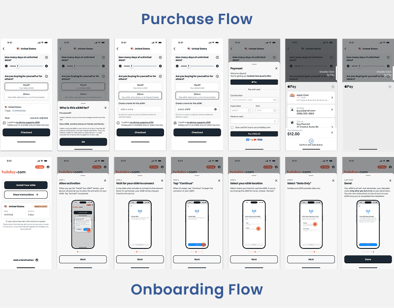
Context
holiday.com is a travel eSIM app by the team behind ExpressVPN. After the lead product designer shipped the first version of the app and moved on, I took over as the sole designer responsible for iterating on the live product.
This case study covers two connected workstreams I led: redesigning the post-purchase onboarding experience, and designing a new multi-purchase flow that lets users buy eSIMs for multiple destinations and other people.
Both projects required me to inherit someone else's design decisions, understand the existing product constraints, and improve the experience without breaking what already worked.
Part 1: Fixing the Onboarding Experience
The Problem
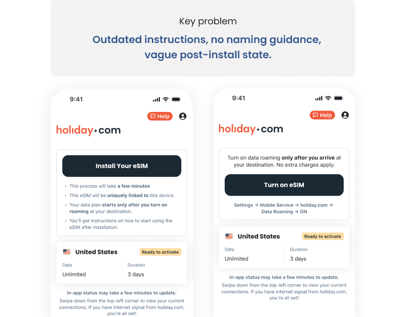
The PM flagged a known issue: after purchasing a data plan, users were struggling with the eSIM installation and activation process. The onboarding flow had several problems:
Instructions were outdated. The setup steps didn't reflect the latest iOS versions, so users were being directed to settings screens that had moved or been renamed.
The flow allowed user error. Users could name their eSIM anything during setup — not just "holiday.com" — which caused confusion later when they needed to identify and activate it. There was no guidance to prevent this.
Post-installation guidance was inconsistent. After installing the eSIM, the app's home screen prompted users to go to their phone's Settings — but not always to the same location. Users didn't know if they'd set things up correctly.
For a product where the entire value proposition is "seamless connectivity when you travel," a confusing setup experience directly undermines trust. If a user can't get their eSIM working before their trip, the product has failed — regardless of how good the network coverage is.
My Approach
I focused on making the setup process what the team internally called "foolproof" — designing it so that users of varying technical ability could complete installation without making mistakes or needing support.
APPROACH 1
Updated the instruction flow to match current iOS versions.
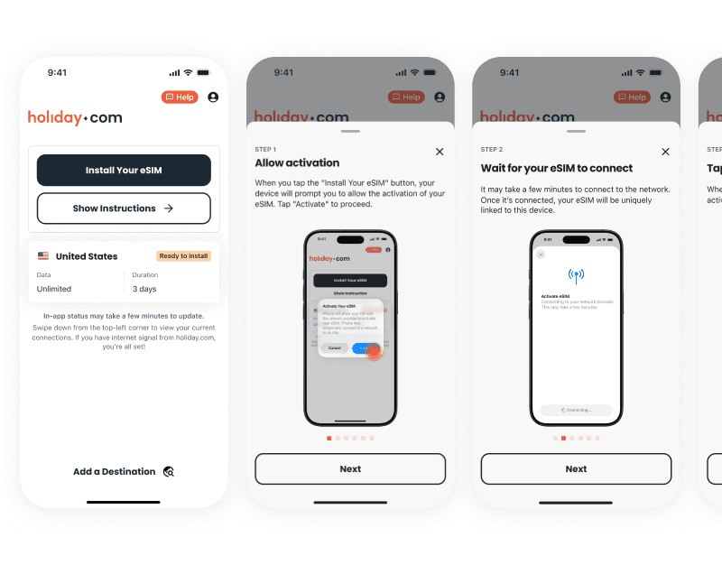
Each step now directs users to the exact Settings location with visual guidance showing what they should see on their screen at each point.
APPROACH 2
Added a "Show Instructions" progressive disclosure pattern.
Rather than overwhelming users with all setup steps upfront, the home screen now surfaces the key status information (eSIM installed, ready to activate) and lets users tap "Show Instructions" to see the detailed step-by-step walkthrough when they need it.
APPROACH 3
Designed a guided activation sequence.
Instead of a vague prompt to "go to Settings," the new flow walks users through a numbered, visual step-by-step process: Open Settings → Select Cellular → Turn on data line. Each step shows a screenshot of exactly what the user should see.
Design Rationale
The core design decision was shifting from a "list of steps" model to a "guided walkthrough" model. The difference matters because:
A list assumes the user can map written instructions to their phone's interface. A walkthrough shows them exactly what to do at each point, reducing the gap between instruction and action.
Progressive disclosure (hiding detailed instructions behind "Show Instructions") keeps the home screen clean for returning users who already know what to do, while still supporting first-time users who need hand-holding.
Part 2: Designing the Multi-Purchase Flow
The Problem
In the original app, users could only add data packs to their single installed eSIM. The business wanted to differentiate from competitors by letting users purchase multiple eSIMs — for different trips, different devices, or even for other people (sharing via QR code or link).
This was a significant expansion of the product's scope: the app needed to go from managing one eSIM to managing multiple, each potentially for a different person, while keeping the core experience simple.
The Design Challenge
The central tension was between two competing goals:
User goal: Complete the most important task first.
After purchasing an eSIM, the user's primary need is to install and activate it before their trip. Anything that distracts from this risks the core experience.
Business goal: Encourage additional purchases.
The multi-eSIM feature only generates value if users discover and use it. The "Add a Destination" action needed to be visible enough to drive additional purchases.
These goals directly compete for attention on the same screen. Making "Add a Destination" more prominent means the install/activate action becomes relatively less prominent — and vice versa.
Three Iterations
This design went through three rounds of iteration, each driven by stakeholder feedback. The evolution reveals a real product design tension that didn't have a clean answer.
Iteration 1: Simplicity First
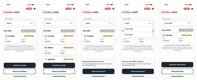
My initial approach: show "Add a Destination" only after the user has installed their eSIM. The rationale was progressive disclosure — let users complete the primary task (install) before introducing a secondary action (buy more). One thing at a time.
Stakeholder feedback: The business wanted users to be able to purchase additional eSIMs regardless of whether they'd installed the first one. Waiting until after installation meant missing a window where users are already in a buying mindset.
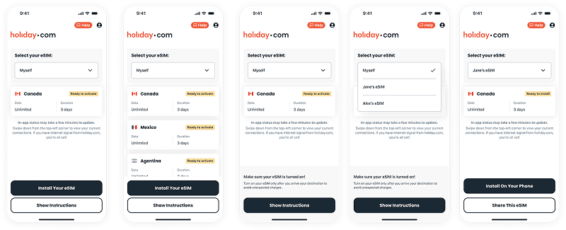
Iteration 2: Subtle Addition
I added "Add a Destination" as a small text button at the top of the data pack list — present but not competing with the primary install action.
Stakeholder feedback: Too small, not prominent enough. Stakeholders felt most users wouldn't notice it, and the feature wouldn't get the adoption needed to justify the development investment.
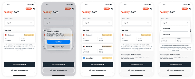
Iteration 3: Prominent CTA (Final)
The final design places "Add a Destination" as a full-width button in the CTA group alongside "Install Your eSIM," giving both actions equal visual weight. A contextual tooltip was added to guide users toward installation, helping offset the increased visual competition.
My Honest Assessment
I shipped the third iteration because it's what stakeholders strongly advocated for, and the business case was sound: making additional purchases frictionless is how the product grows.
But I have a genuine design concern with this approach. Installing and activating the eSIM is the most critical action on the screen — it's the thing that determines whether the user's trip goes smoothly or not. Giving "Add a Destination" equal visual weight risks diluting the urgency of that primary task, especially for less tech-savvy users who may already be uncertain about the setup process.
If I had data to work with, I'd advocate for testing two versions: the current equal-weight approach against a progressive disclosure approach where "Add a Destination" appears with less prominence initially and becomes more prominent after the user's first eSIM is successfully installed. My hypothesis is that the progressive approach would protect onboarding completion rates while still driving multi-purchase discovery — but without live testing, this remains an open question.
This is a tradeoff I'd want to revisit once usage data is available.
Additional Scope: eSIM Sharing
The multi-purchase feature also included the ability to buy eSIMs for other people. Users can purchase an additional eSIM and share it via QR code or link — the recipient can install it directly without downloading the app.
This expanded the product from a personal travel tool to something that could serve families, travel groups, and business travelers managing connectivity for teams.
What I Learned
Inheriting a product requires restraint. When you take over someone else's design, the temptation is to redesign everything. The more valuable skill is identifying what's actually broken versus what's just different from how you would have done it. The onboarding flow had real usability problems worth fixing. The overall app architecture didn't need to be rethought.
Stakeholder disagreements aren't always resolvable — and that's OK. The "Add a Destination" prominence debate didn't have a clear right answer. I made my case for progressive disclosure, I understood the business rationale for prominence, and I shipped a solution I could stand behind even if it wasn't my first choice. The professional move was documenting the tradeoff and flagging it for future testing — not digging in on a position I couldn't prove with data.
Foolproof design is harder than clever design. The onboarding redesign wasn't flashy — it was screenshots of Settings screens and numbered steps. But making something truly foolproof for users of all technical abilities requires more care and empathy than designing a delightful interaction for confident users. Every word, every screenshot, every step order matters when the user is already anxious about whether their phone will work when they land.
Let's Connect!
Always down for collaborations. I love to make products even more meaningful.