Building a Design System for Visual Consistency & Scalable Efficiency
Role: Lead Designer — Collaborated closely with designers and developers to turn static designs into a reusable, unified design language using Figma.
The Challenge
With no existing design system in place, the team faced repeated issues across design and development:
Recreating the same components in every project
UI and UX inconsistencies across screens
Slower product development due to fragmented workflows
This lack of systemization was costing the team time, clarity, and cohesion.
Why a design system
To address these inefficiencies, I proposed and led the creation of a shared design system. A well-structured design system acts as:
A single source of truth for components, styles, and patterns
A scaling engine for both design and development teams
A consistency enforcer across all touchpoints
A time-saver by enabling designers to build with reusable elements
Approach and Process
To ensure alignment and collaboration from the start, I kicked off the project with:
A style guide audit with the design team
Team availability planning and project scope alignment
A clear timeline and phased plan for rollout
Weekly check-ins with designers and engineers to keep momentum and resolve blockers early
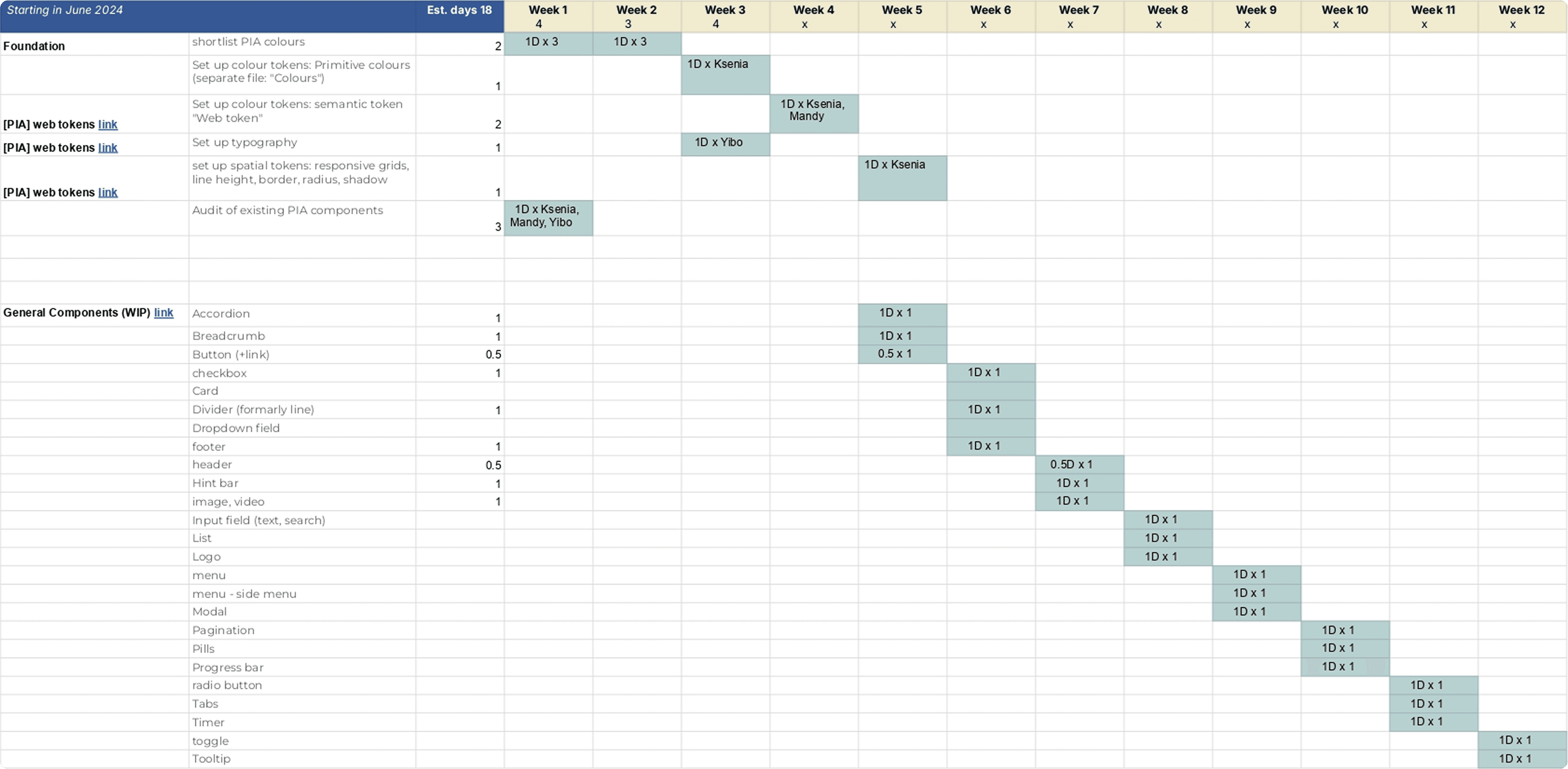
I framed this project into 3 phases
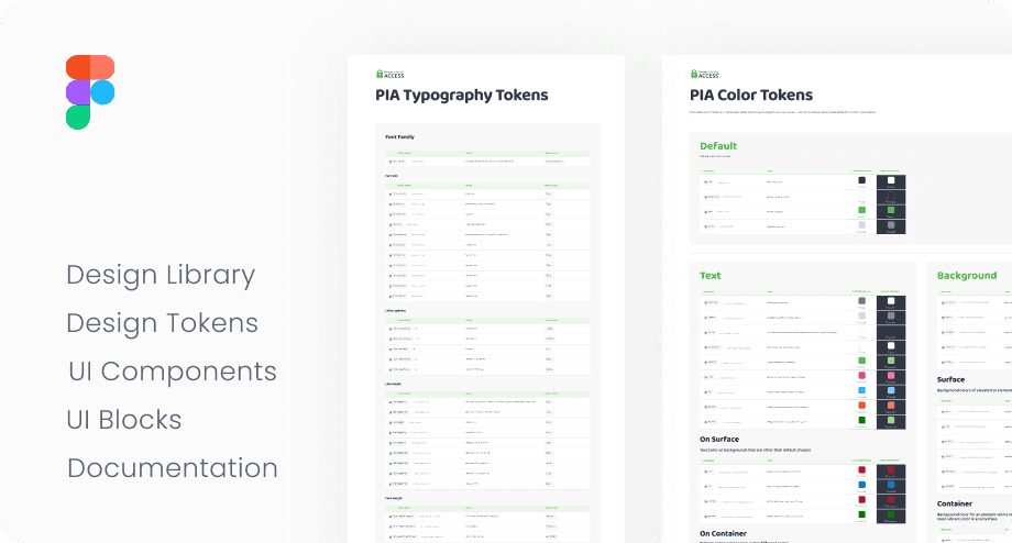
Design token
Core Components
Web Content Blocks
Engineers were involved from the beginning to ensure feasibility and alignment across tools and implementation.
Phase 1: Design Tokens
Tokens are the foundational values that drive the system—typography, colour, spacing, and more.
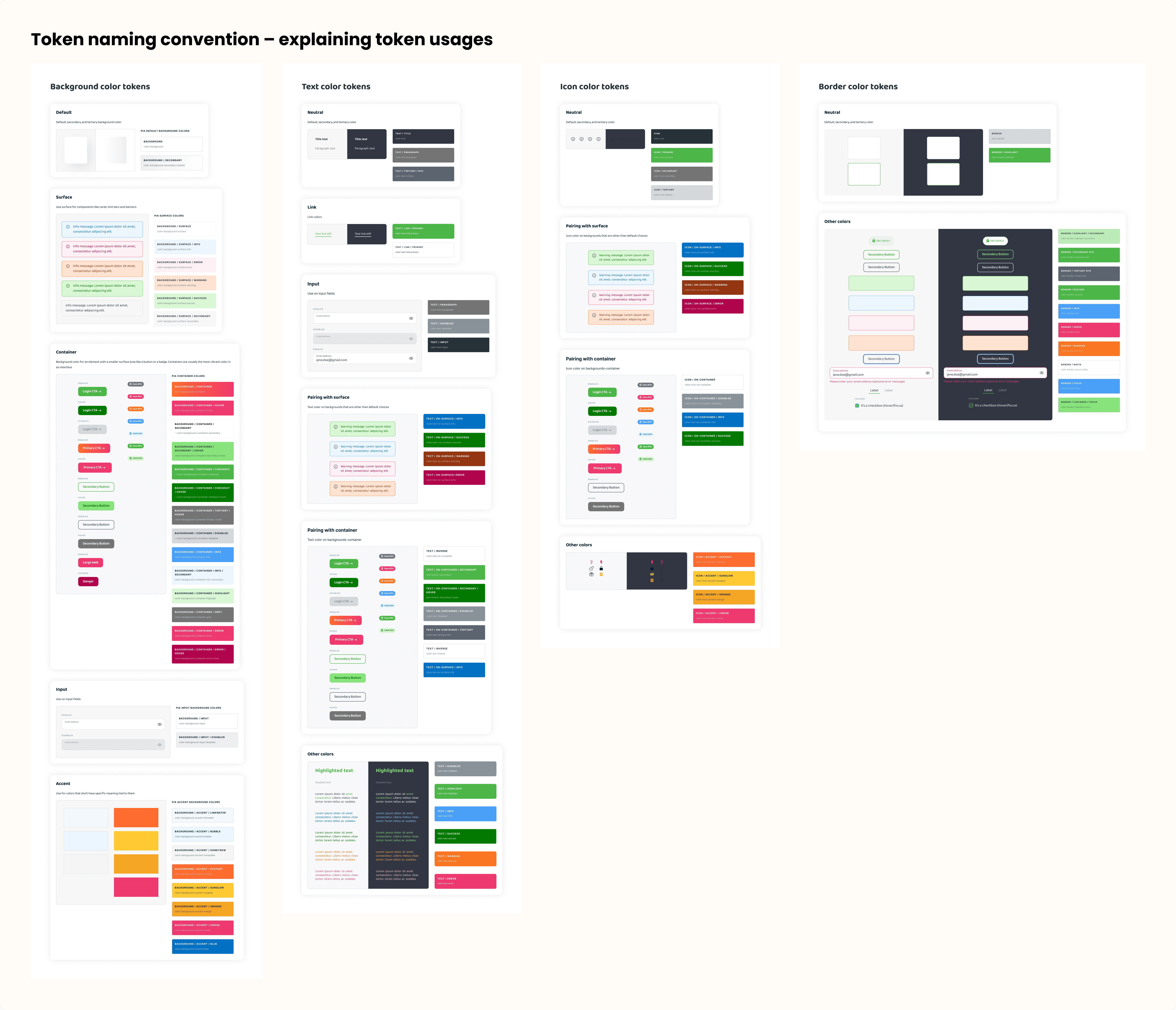
Colour tokens
We first defined primitive tokens (base color hex values like #0A0A0A and names)
Then layered in semantic tokens (e.g., Primary-Button-Default) tied to purpose, not appearance
To align everyone, we created a colour naming convention board with guidance on when and how to use each colour

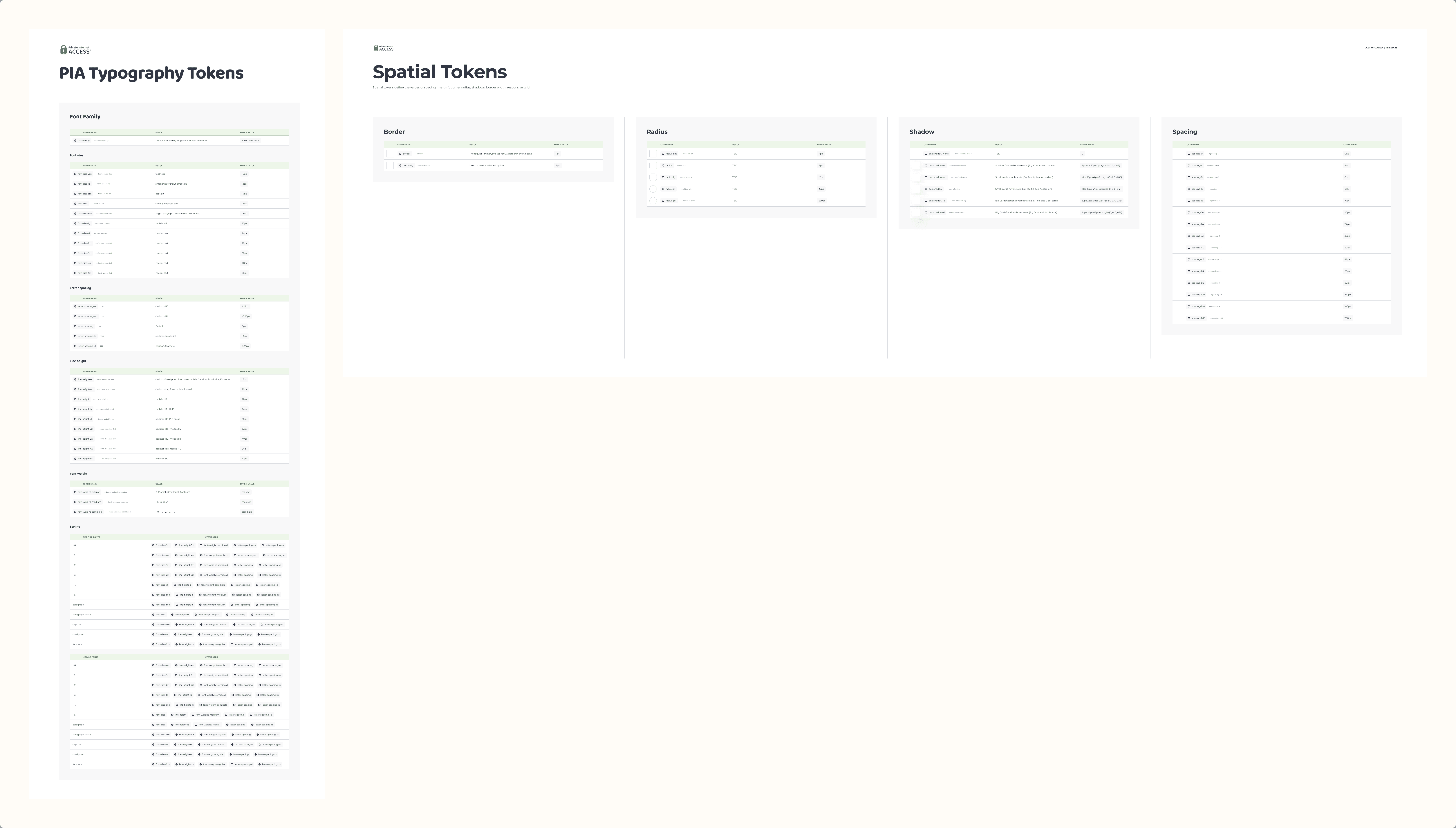
Typography tokens and Spatial tokens
Created modular typography styles for all breakpoints
Defined spacing rules (e.g., 4pt grid) for consistent vertical rhythm
Phase 2: Core Components
These are the building blocks of every product screen, such as:
Buttons (default, hover, disabled)
Inputs and form fields
Navigation elements (menus, accordions, tabs)
We made sure every component:
Included all interactive states
Followed naming conventions for easier handoff
Was built to be fully responsive
Phase 3: Web Content Blocks
Using our core components, we created reusable content blocks (hero sections, FAQs, pricing modules, etc.) that could be dropped into page layouts.
Each block:
Supported desktop, tablet, and mobile breakpoints
Included developer notes for behavior/interaction
Used intuitive naming to prevent miscommunication across teams
Outcomes & Learnings
Although the system is still evolving, it has already made a measurable difference:
Designers create screens faster and with more consistency
Developers spend less time clarifying specs or remaking elements
The product feels more cohesive and professional across the board
Key Takeaways
Education is everything. A design system is only as good as its documentation and onboarding. We invested time in internal guides to ensure the system was used as intended.
It’s a living system. Our design system isn’t “done”—it evolves with the product. We continue to update components and tokens to reflect new needs.
Early alignment with devs pays off. Involving engineers from day one helped prevent future rework and strengthened cross-team collaboration.
Let's Connect!
Always down for collaborations. I love to make products even more meaningful.